Cradlepoint
About
Cradlepoint is headquartered in Boise ID with approximately 1,000 employees. They help customers utilize 4G and 5G cellular technology to connect people, places, and things anywhere. They specialize in 4G LTE Networking Solutions, Network Failover Solutions, Cloud Networking, Transportation Networking Solutions, Wireless WAN, Private 5G, Private LTE, and Private Cellular Network to name a few.
My Role
As an Interaction Designer, I create low-fidelity mockups, high-fidelity visual designs, and interaction patterns from undetailed specifications and requirements. I work closely with other designers, engineers, product managers, QA, and program managers to create, build, best in class user experience for Cradlepoint’s SaaS product.
Featured Projects
Cell Tower
Proposal
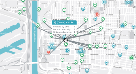
Pull all cellular ID data needed into NetCloud Manager (NCM) to determine which cell tower the modem is connected to. Use the cell tower data in NCM to determine the relative location of all endpoints using wireless WAN. Collect cell tower data into NCM for all endpoints. Display the location of all endpoints from an account on a global map to understand current install-based locations. Build and expose location-based business intelligent insights and Implement advanced feature packages.
TASK: UI/UX Design
TOOLS: Sketch, Sympli
Situation
As a NetCloud Manager user, you face challenges in managing geographically diverse networks, such as locating devices, optimizing connections to cell towers, and troubleshooting network issues. Tools that enable efficient mapping of device locations, analyzing proximity to towers, and filtering by geographic criteria are essential for maintaining seamless connectivity and optimizing network resources.
Execution
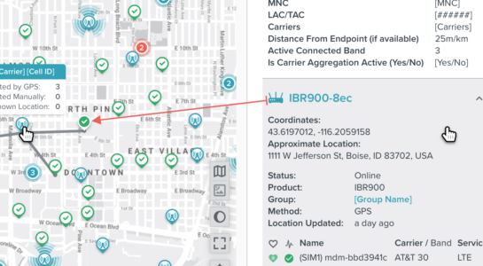
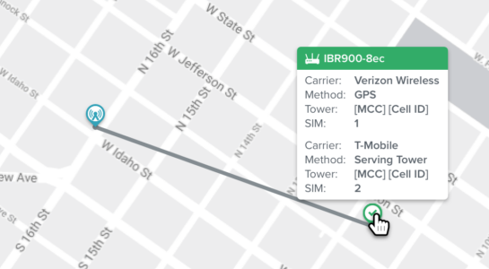
Design intuitive map icons and menus to visualize celltowers and devices, with details like Carrier ID, Modem Name, and distances. Create a user-friendly interface that links devices to towers, offers detailed information in a single panel, and supports advanced filtering and insights.
By conducting user research, sketching concepts, and refining designs through high-fidelity mockups, the solution integrates user feedback and aligns with project goals. The result is an enhanced tool that improves network visualization, optimizes device placement, and strengthens deployment strategies—particularly for rural areas or 5G readiness—while ensuring seamless integration with LTE services.
Case Study On Icons
Problem
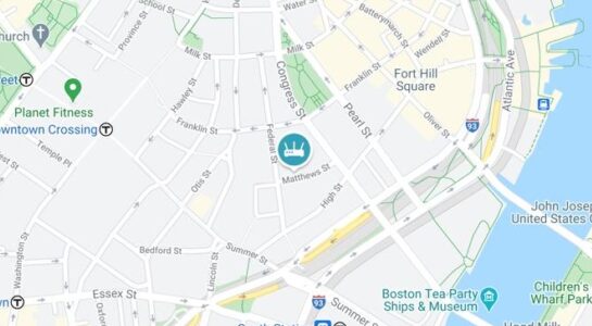
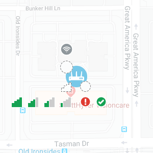
Size, the current icons are pretty large and cover the map, it's not a great viewing experience. The current icons lack a pointer, so it’s hard to pinpoint the exact location of the device when looking at the map.
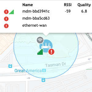
The badges on the icon could look pretty cluttered especially when there are several 100 devices nearby of each other.
Not having consistency across the entire platform. For example in Home Dashboard, Cellular Health, and Geoview.
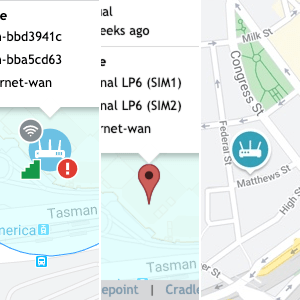
Having so many different available combinations available which could potentially cause technical problems when rendering the location on the map.
Goal
To give a clear, consistent view of the device’s location and status (online/offline) on all maps in NCM.
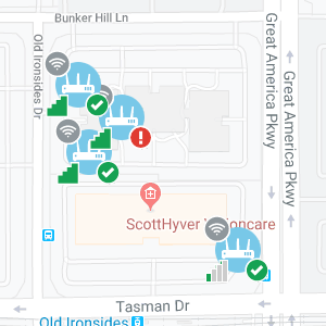
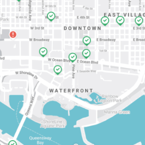
This is an example of a zoomed-in map, where devices are
clearly displayed as either online or offline.
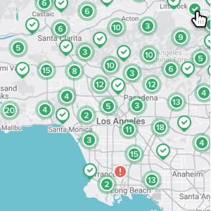
In this example, the map is zoomed out, showing clusters
grouped by location and online status.
Impact
The online/offline icons reside throughout NCM and are incorporated into all maps, the Home Dashboard, Cellular Health, and Geoview, with a consistent look and feel. The Users are used to seeing this icon.
Solution
I gathered information from Google Maps and Zillow’s website to get a better feel of how to display large amounts of data points in a single map. With a clear, consistent view of each router, all users can see the status at a glance.
Bonus Info
Going The Extra Mile
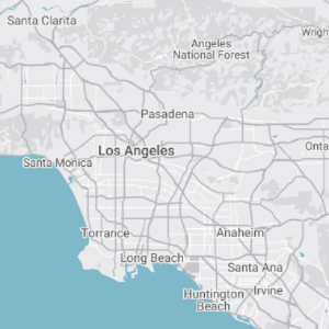
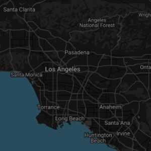
As a proof of concept, I created an entirely new map designed to align with our interface, incorporating colors from our style guide. To enhance user experience, I developed both a light mode and a dark mode, giving users the flexibility to choose their preferred theme.
Full Screen
Speed Test
Proposal
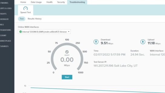
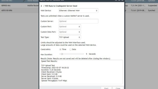
Update and re-architect Speed Test to address known limitations to both back-end and front-end. To increase functionality and value for more accurate results that are stored for both historical customer visibility and leverage for Cradlepoint AI and ML to provide business intelligent insights.
TASK: UI/UX Design
TOOLS: Sketch, Sympli
Situation
Quick performance assessments are essential during installation, post-installation, and troubleshooting of wireless WAN connections. Installers need immediate insight into connection types (5G, 4G, or 3G), especially for 5G setups requiring extra steps. An intuitive, visually appealing interface is crucial for ease of use, efficient decision-making, and streamlined troubleshooting.
Execution
I developed a solution within Cradlepoint's wireless WAN platform to address the need for streamlined performance monitoring and troubleshooting. This involved designing intuitive user interfaces that offered immediate network performance insights and connection-type identification (5G, 4G, or 3G).
To enhance remote troubleshooting, I incorporated on-demand Speed Test functionality and built a scheduling system for storing and analyzing Speed Test results in real time and historically. Leveraging APIs, I ensured seamless integration of these features, creating a cohesive and user-friendly experience. This solution simplified installation, improved performance assessment, and supported accurate troubleshooting, delivering value to customers and stakeholders alike.
Single Sign-on
Proposal
Implementing Single Sign-On (SSO) can enhance user experience and strengthen security for any organization. SSO simplifies authentication by allowing users to access multiple systems with a single set of credentials, reducing password fatigue and minimizing IT support demands. By centralizing access management, SSO provides better control over permissions and improves audit capabilities. This approach streamlines workflows, increases efficiency, and aligns with the goal of delivering innovative and user-friendly solutions.
TASK: UI/UX Design
TOOLS: Sketch, Sympli
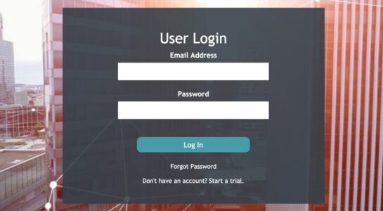
A New Take On The Orignal Design
This redesign refines the original by introducing a smaller, solid-colored dialog box to enhance prominence and clarity. Incorporating the font, text fields, and button from the design system ensures better alignment with the overall UI. The background is blurred to reduce visual competition, while relocating the logo to the bottom left and removing its color increases its visibility and prominence compared to its previous placement in the upper left corner.
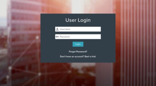
A Completely Different Design
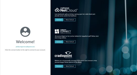
This design takes a completely different approach by positioning the login box on the left-hand side and incorporating a large background image that complements the interface’s color scheme. By integrating UI elements from previous screens, the design creates a more cohesive and visually engaging user experience.
Get In Touch

