HP | Express Decision Portal | UX/UI Design
Redesigning the Express Decision Portal
A cloud-based portal for customers, partners and HP support: moving the interface from dark gray and black to a blue and white design, backed by design specs for engineers.

Role
Advanced Interaction Designer: UI/UX design
Timeline
Mar 2014 – Aug 2017
Tools
Axure Pro, Photoshop
Team
HP global business and engineering teams
Overview
The problem
The HP Express Decision Portal is a cloud-based application designed to streamline communication and decision-making among customers, partners, and HP support in the context of managed print services (MPS).
It serves as a centralized platform that connects all parties involved, offering features like pricing tools and service request management, with a user-friendly interface for submitting requests, accessing information, and managing service tickets.
The portal used a dark gray and black design.
Approach
My role and process
I translated conceptual sketches into functional prototypes using Axure Pro, and maintained design system specifications, graphics, icons, and images using Photoshop and Axure Pro. I created wireframes, user interaction models, information architecture, and user screen flows. I collaborated with HP's global business teams to align UI/UX designs with organizational priorities, and supported the engineering team by contributing to custom widgets and UI elements.
1
Sketches to prototypes
Conceptual sketches turned into functional prototypes in Axure Pro.
2
Structure and flows
Wireframes, user interaction models, information architecture and user screen flows.
3
Redesign
During my extended contract I undertook the redesign of the user interface, from the previous dark gray and black design to a blue and white interface.
4
Build with engineering
Custom widgets and UI elements with the engineering team, and design specs to guide implementation.
Before and after
From dark gray and black to blue and white
Sample screens from the two versions. They are different pages of the portal, not the same page before and after.
Before
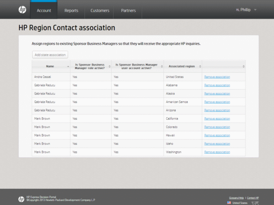
Before
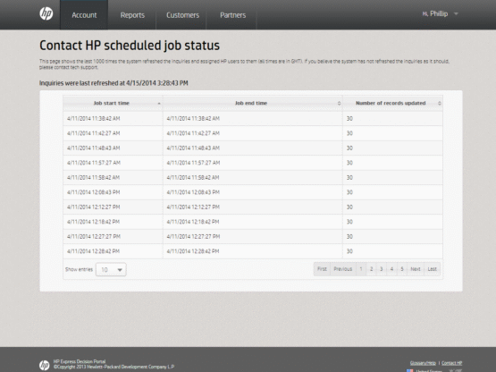
After
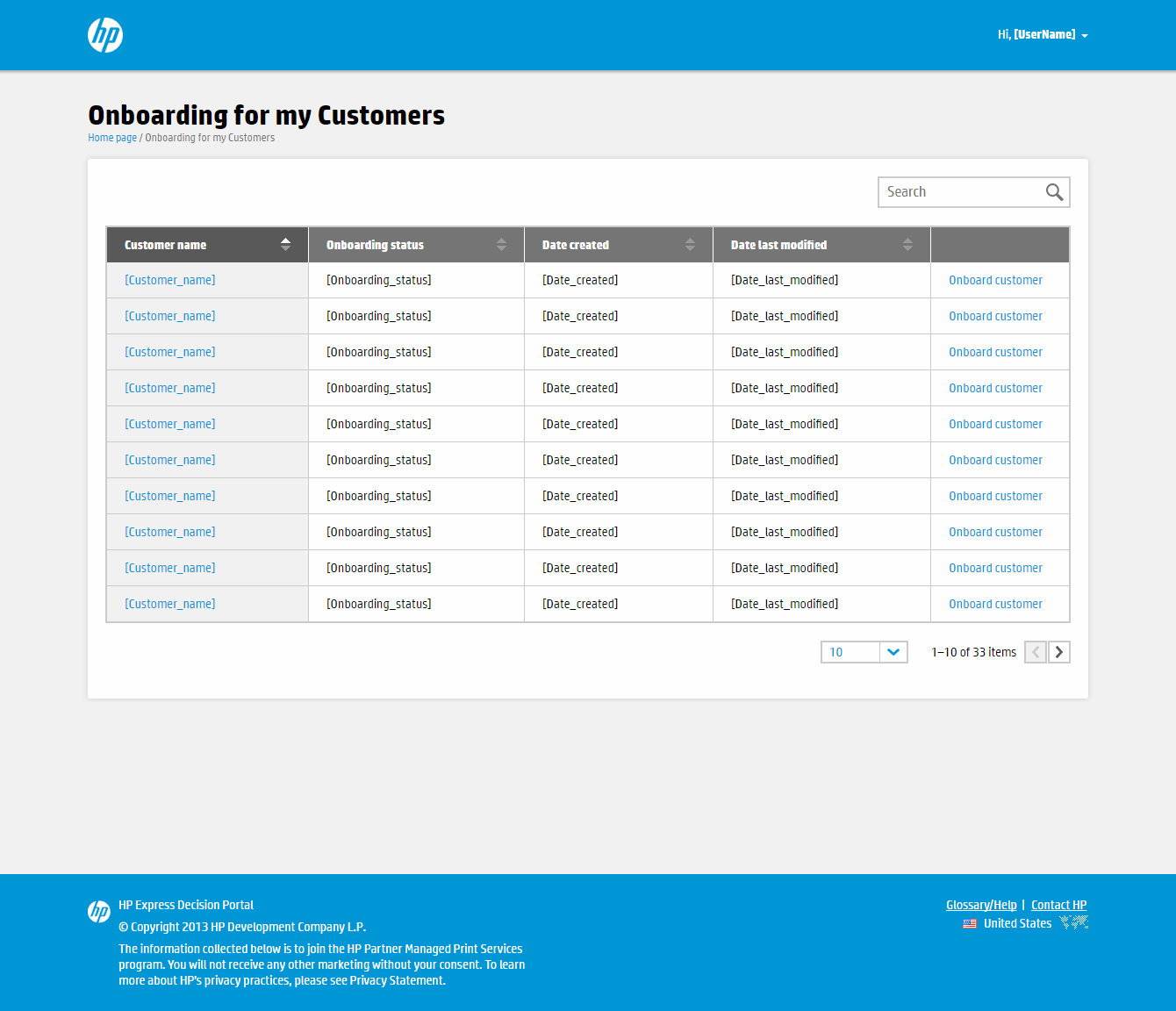
Onboarding for my customers: searchable customer table.
After
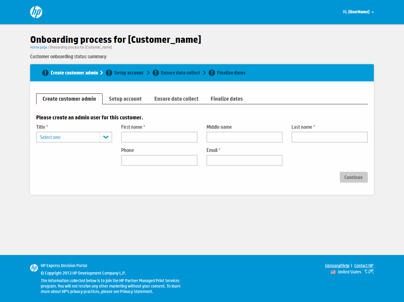
Onboarding process: four-step progress bar and form.
After
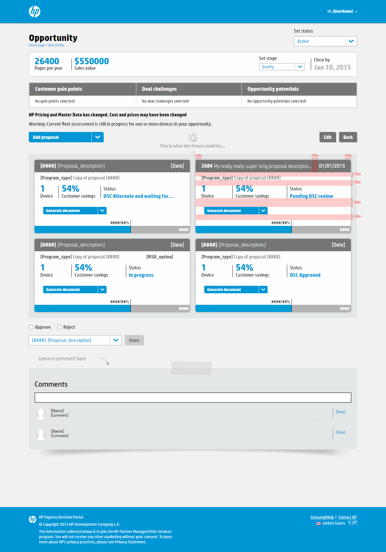
After
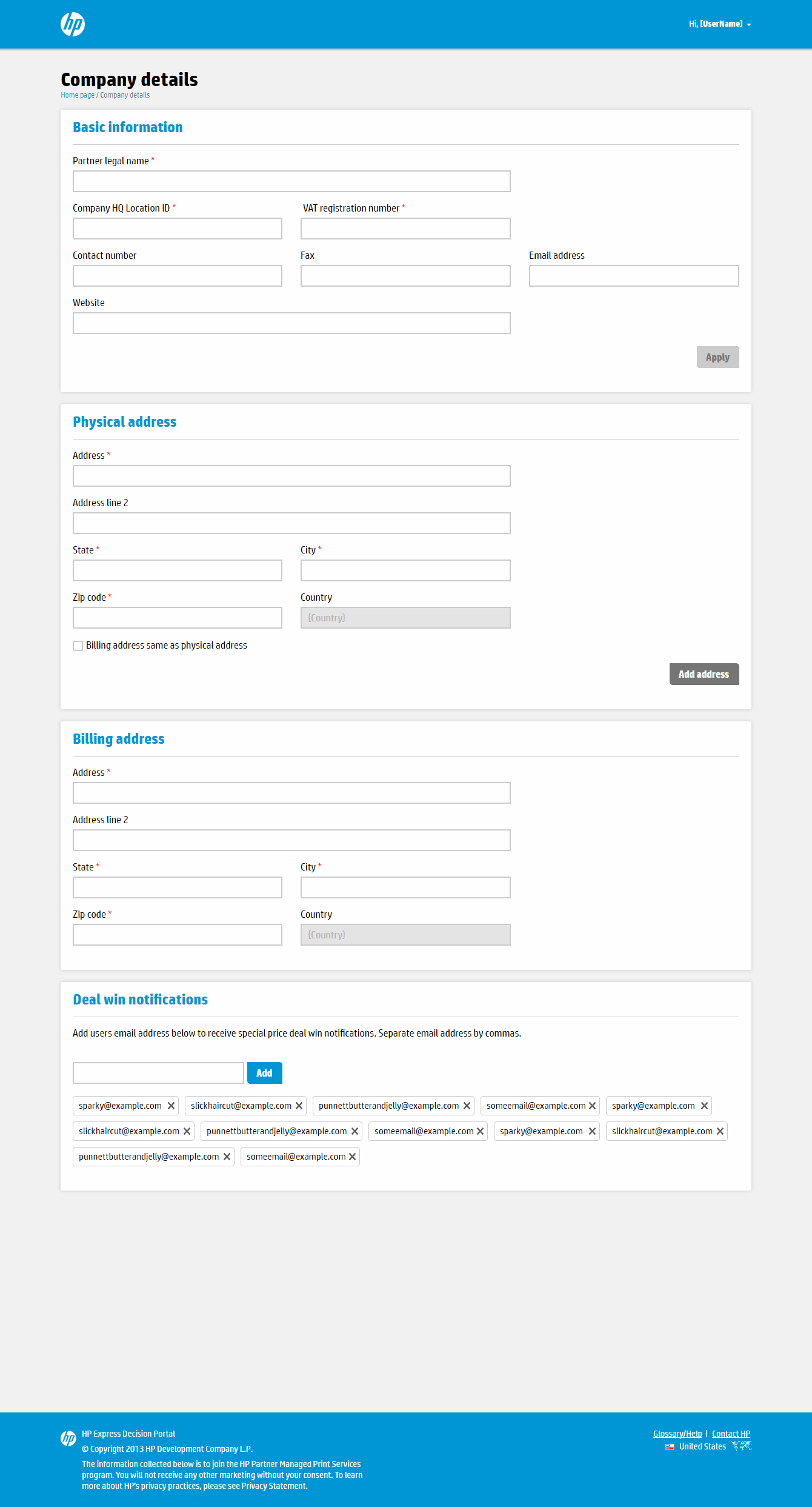
After
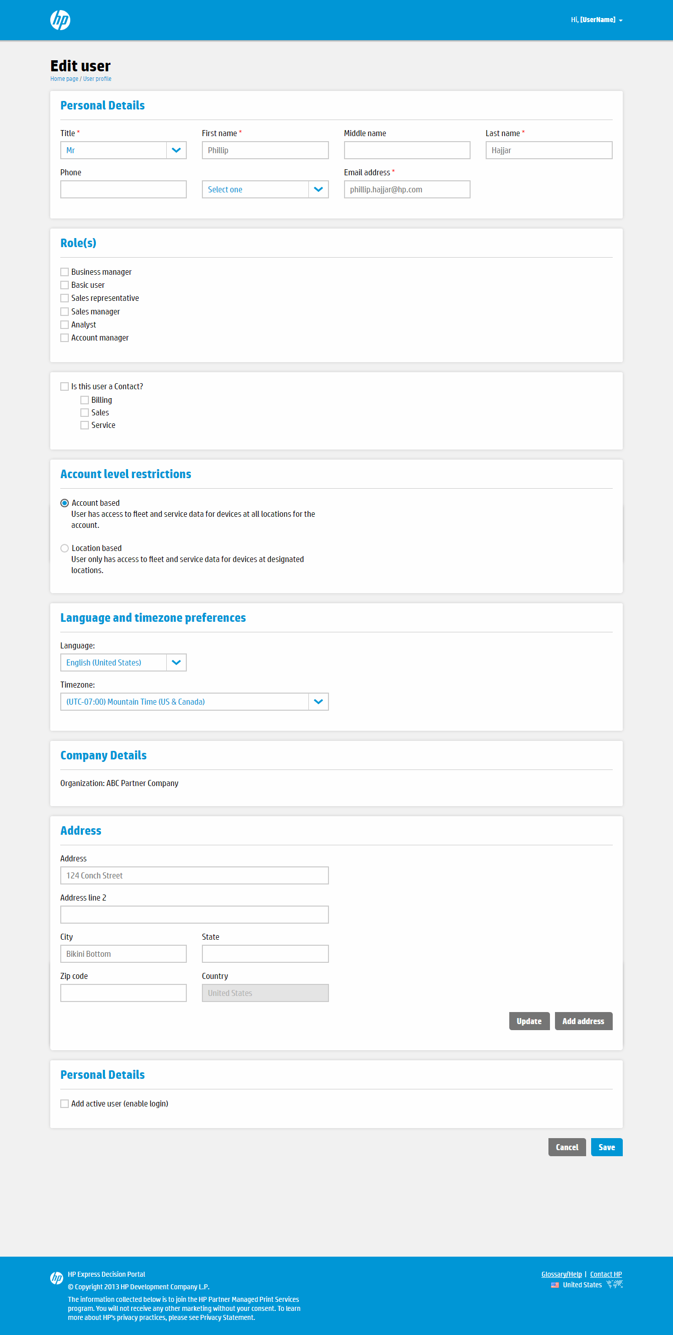
After
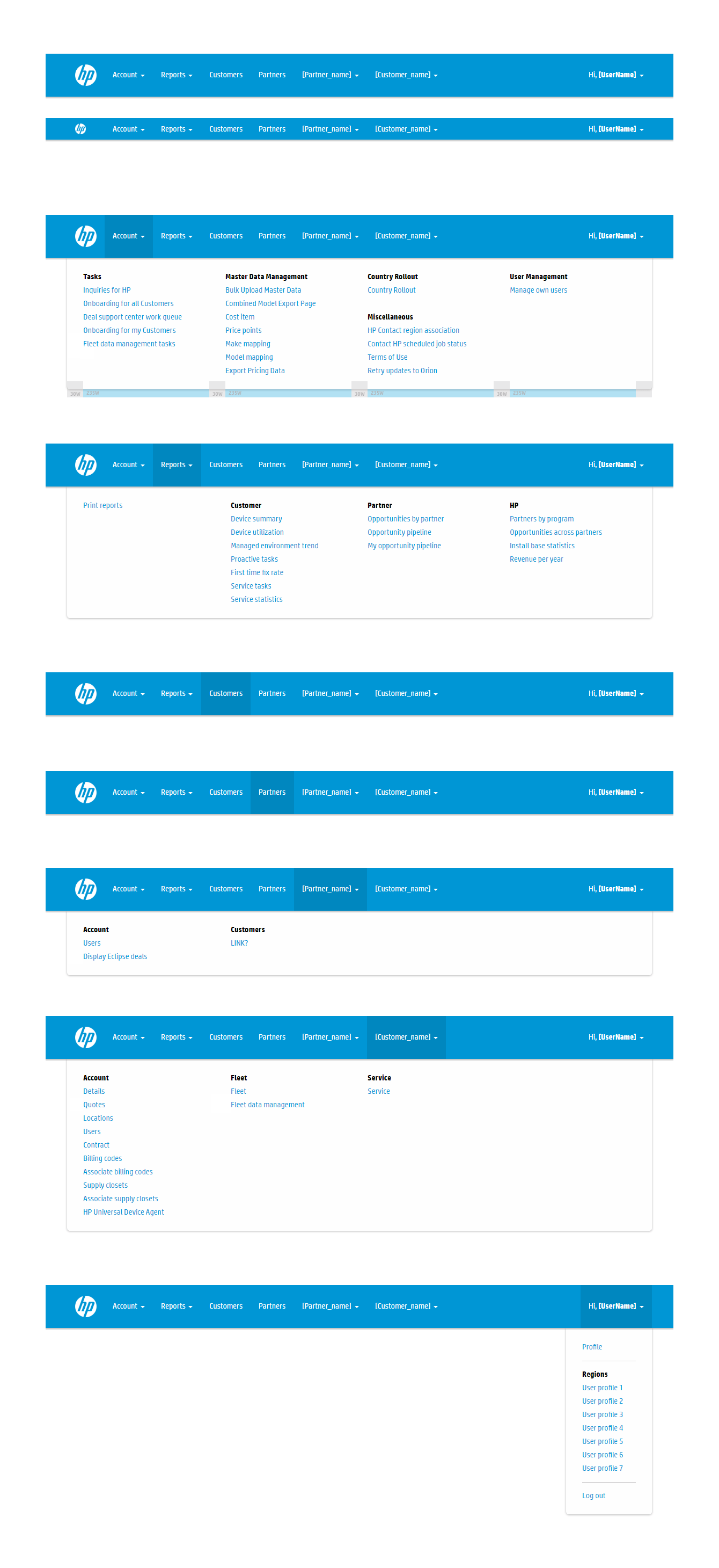
Supporting work
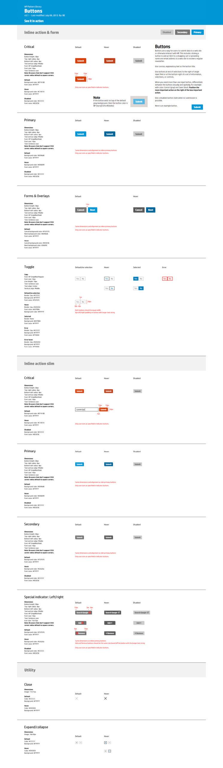
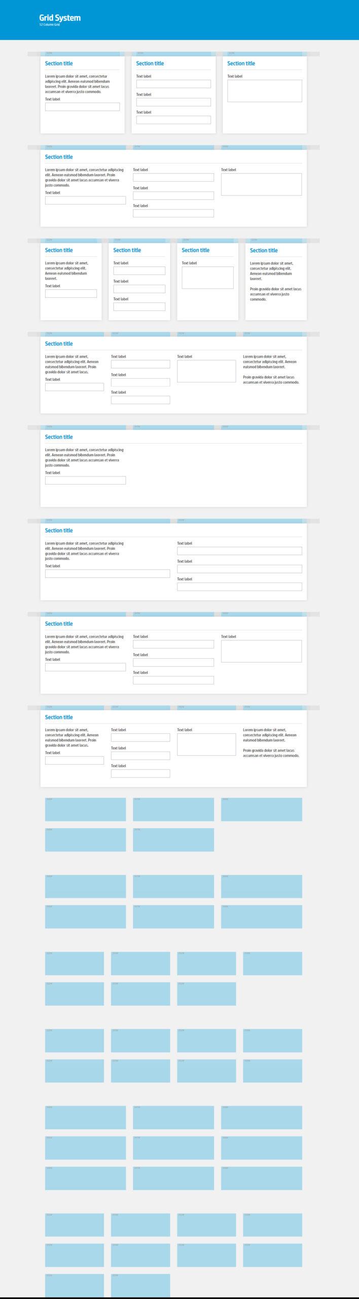
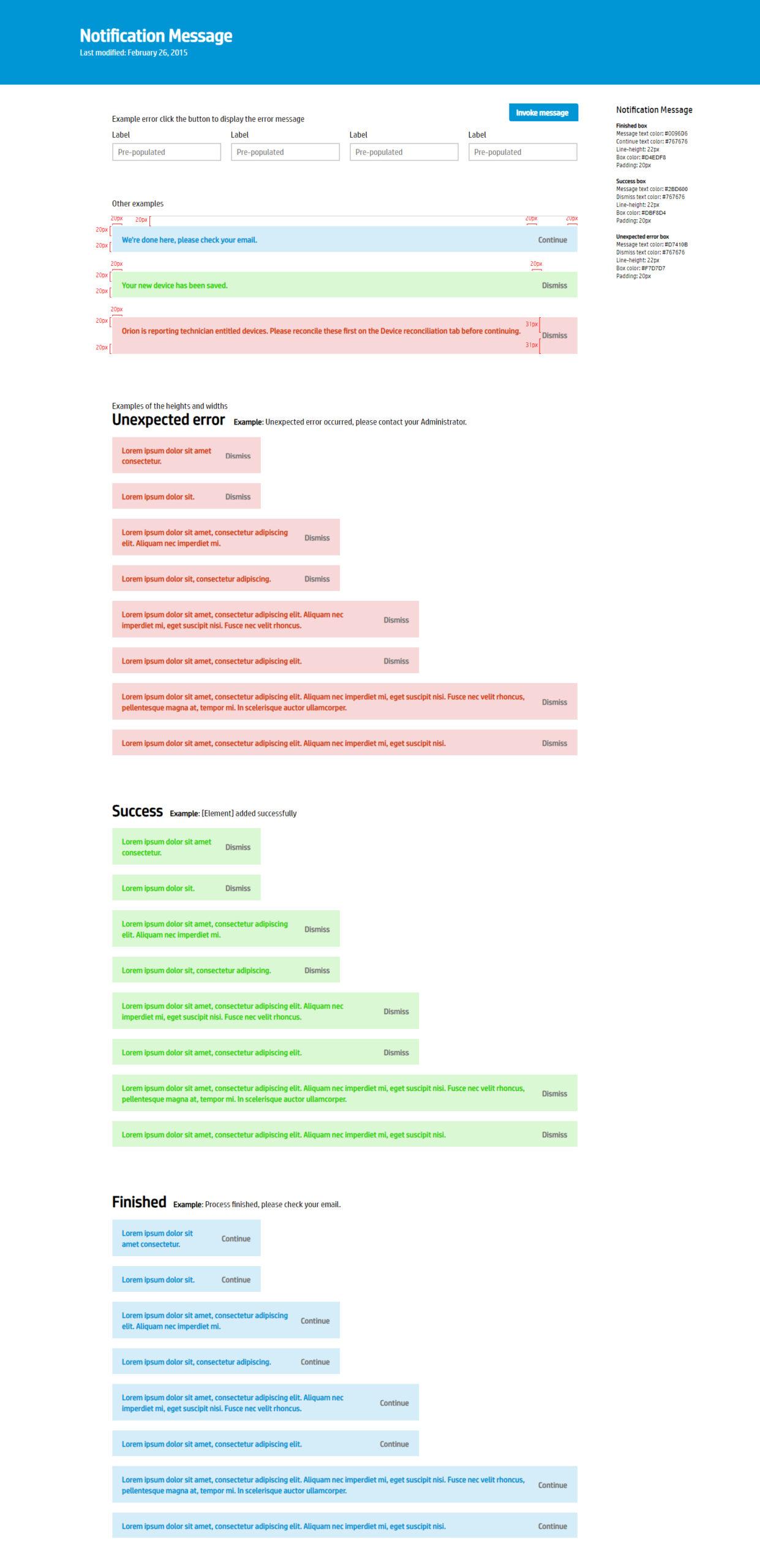
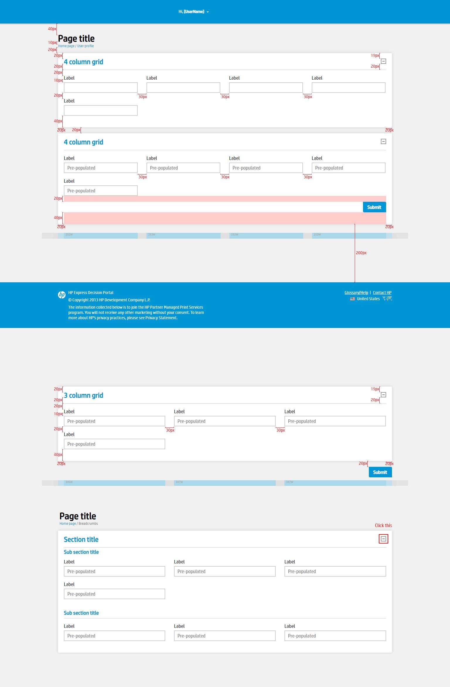
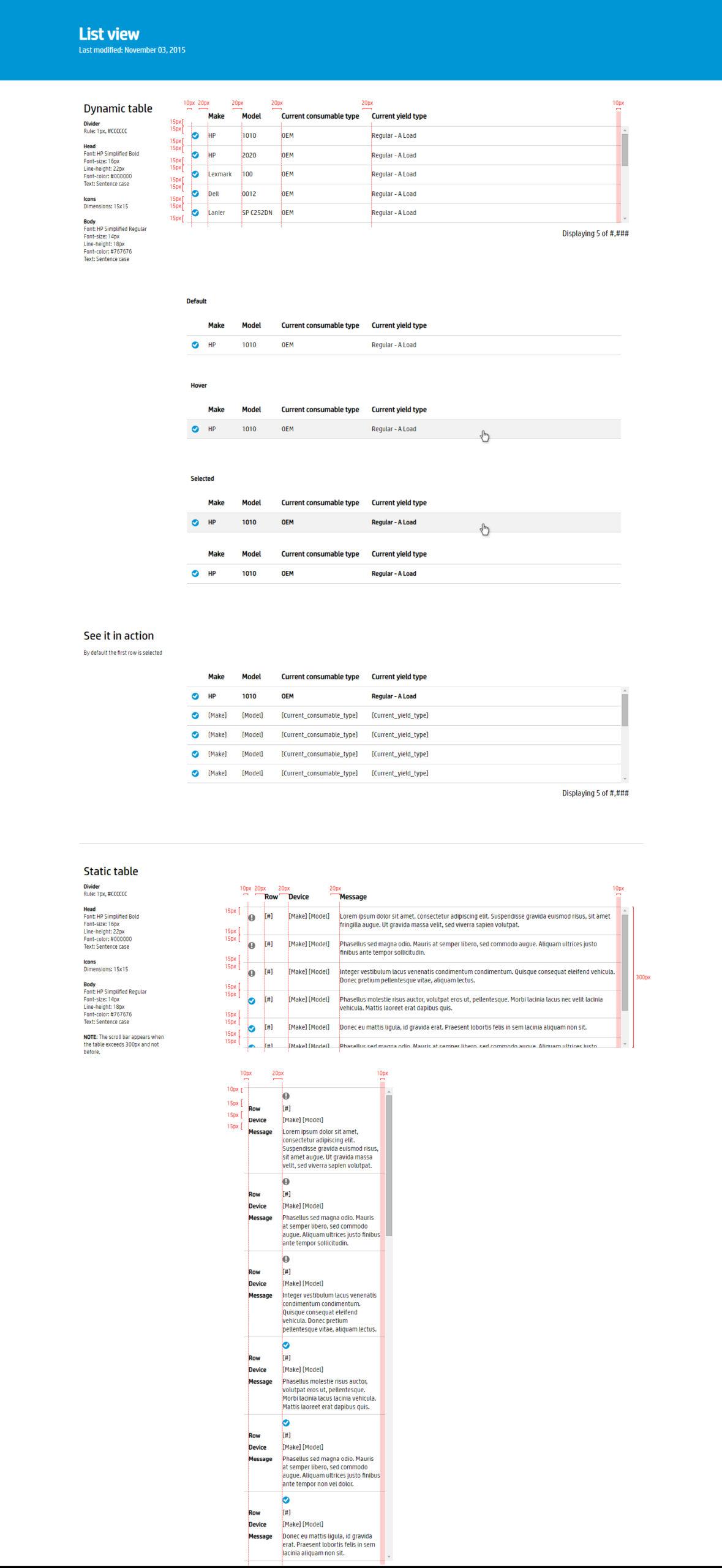
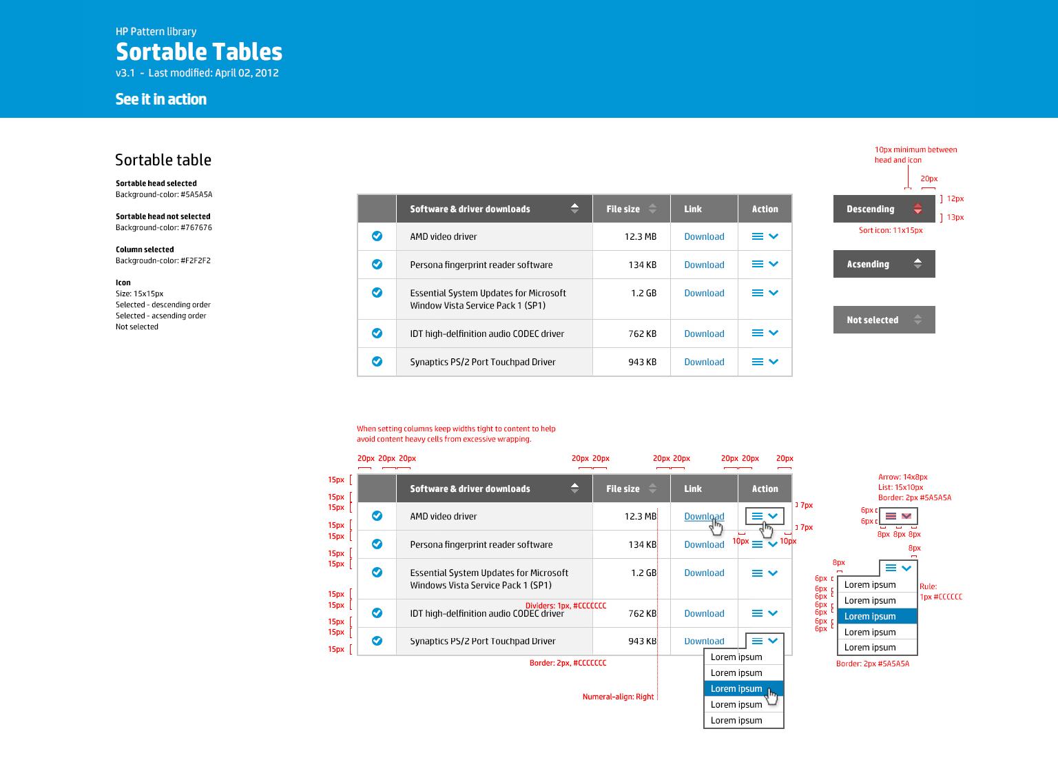
Design system specs
Design specs communicate detailed instructions and guidelines for translating design concepts into fully implemented products. They specify measurements, colors, fonts, and layouts, promote consistency and efficiency, and give designers and developers a shared reference point for handoff.
Outcome
Impact
What changed
The point of using dummy text for your paragraph is that it has a more-or-less normal distribution of letters. making it look like readable English.
The point of using dummy text for your paragraph is that it has a more-or-less normal distribution of letters. making it look like readable English.
Reflection
What I learned
What changed
The point of using dummy text for your paragraph is that it has a more-or-less normal distribution of letters. making it look like readable English.
The point of using dummy text for your paragraph is that it has a more-or-less normal distribution of letters. making it look like readable English.
Next project
Cradlepoint: Cell Tower
Re-architecting the on-demand Speed Test for installers and remote troubleshooting.
Let's talk
Meridian, ID
designed@philliphajjar.com
Website Designed by Phillip Hajjar