Cradlepoint | NetCloud Manager | UX/UI Design
Showing devices and cell towers on one map
Designing how NetCloud Manager users locate devices, see which cell tower each one connects to, and read status at a glance, plus the online/offline map icons used across the platform.

Role
Interaction Designer III: UI/UX design
Timeline
Jan 2019 – Nov 2024
Tools
Figma, Sketch, Sympli
Team
[Add Team]
Overview
The problem
As a NetCloud Manager user, you face challenges in managing geographically diverse networks, such as locating devices, optimizing connections to cell towers, and troubleshooting network issues.
Tools that enable efficient mapping of device locations, analysis of proximity to towers, and filtering by geographic criteria are essential for maintaining seamless connectivity and optimizing network resources.
Proposal
Pull all cellular ID data needed into NetCloud Manager (NCM) to determine which cell tower the modem is connected to. Use the cell tower data in NCM to determine the relative location of all endpoints using wireless WAN. Display the location of all endpoints from an account on a global map to understand current install-based locations. Build and expose location-based business intelligent insights and implement advanced feature packages.
Approach
Process
Design intuitive map icons and menus to visualize cell towers and devices, with details like Carrier ID, Modem Name, and distances, and a user-friendly interface that links devices to towers and offers detailed information in a single panel, with support for advanced filtering and insights.
1
User research
Stated on the site, no detail given.
2
Sketching concepts
[Add 1–2 sketches or wireframes]
3
High-fidelity mockups
Refined in Sketch and handed off with Sympli, integrating user feedback and aligning with project goals.
4
Interaction design
A bottom-left message lists all devices and cell towers (click to view). The map shows online/offline devices and towers. Hovering over icons reveals connection paths, Carrier and Cell ID details. On click, a display panel opens with further information about the device.
The design
Devices, towers and the detail panel
Hover over an icon to see its connection path, Carrier, and Cell ID. Click to open the display panel.
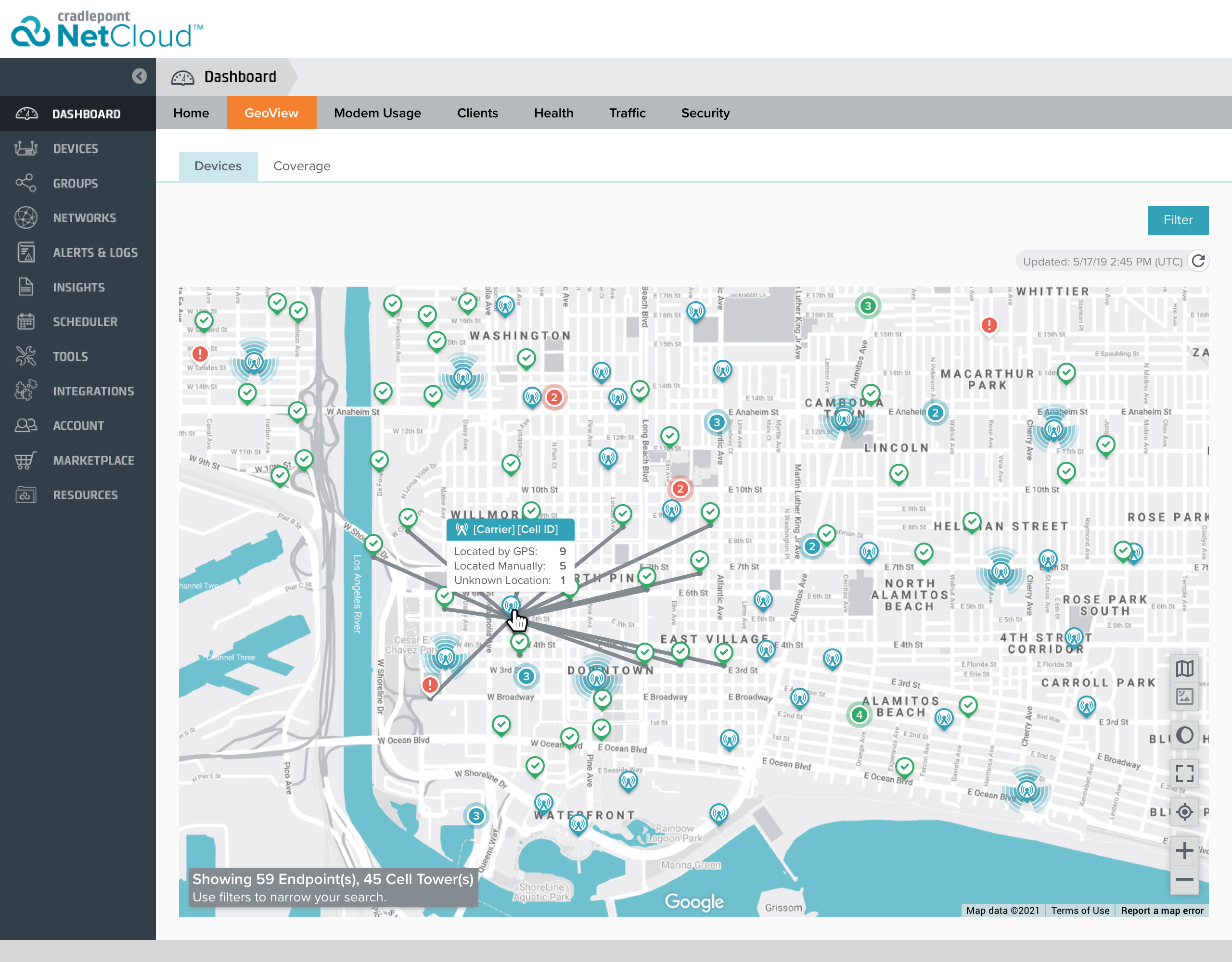
Map overview. Endpoints and cell towers on one map, with connection lines from a tower to its devices. The message at bottom-left shows the count of endpoints and cell towers.
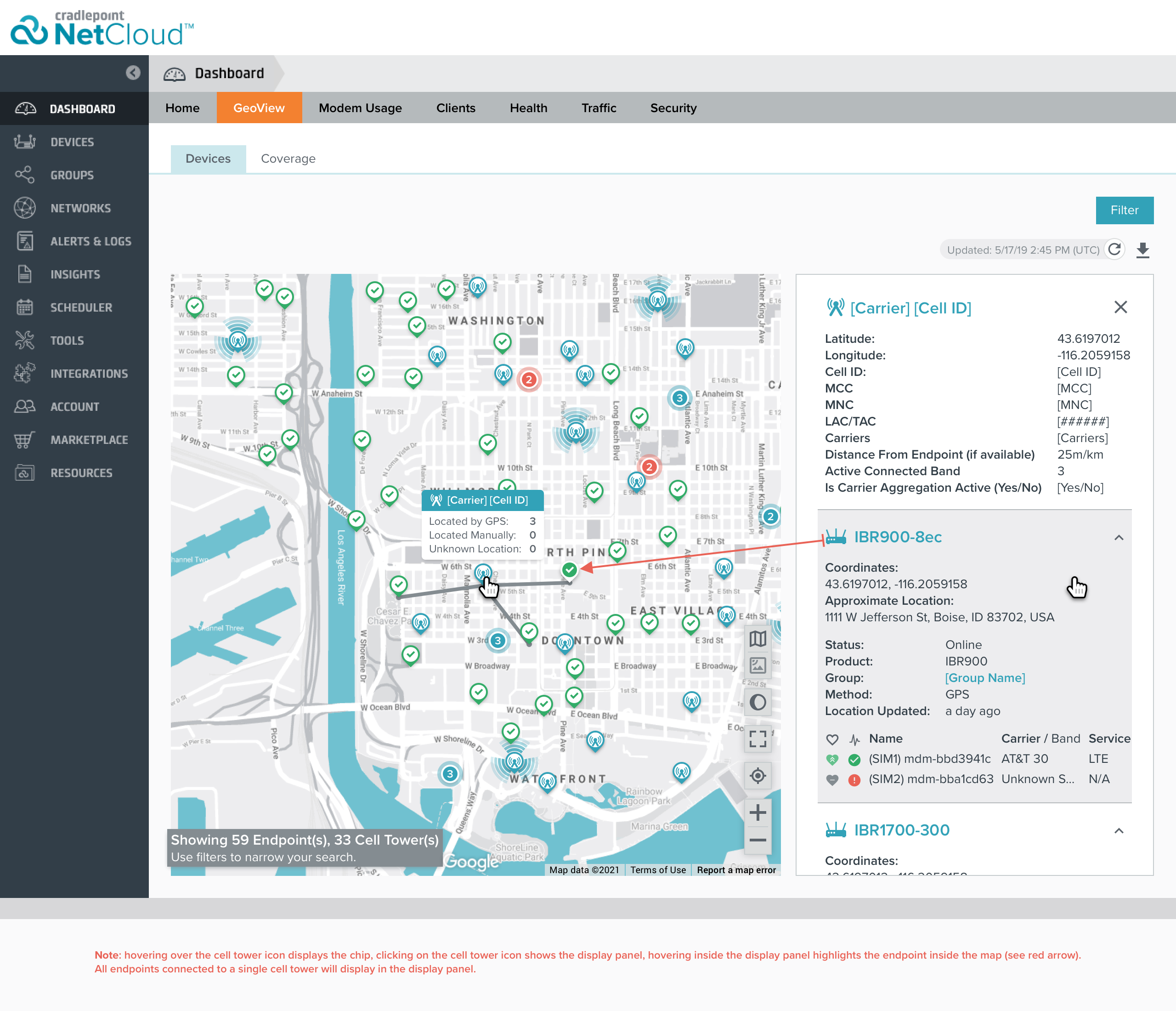
Display panel. On click, the display panel opens, revealing further information regarding the device.
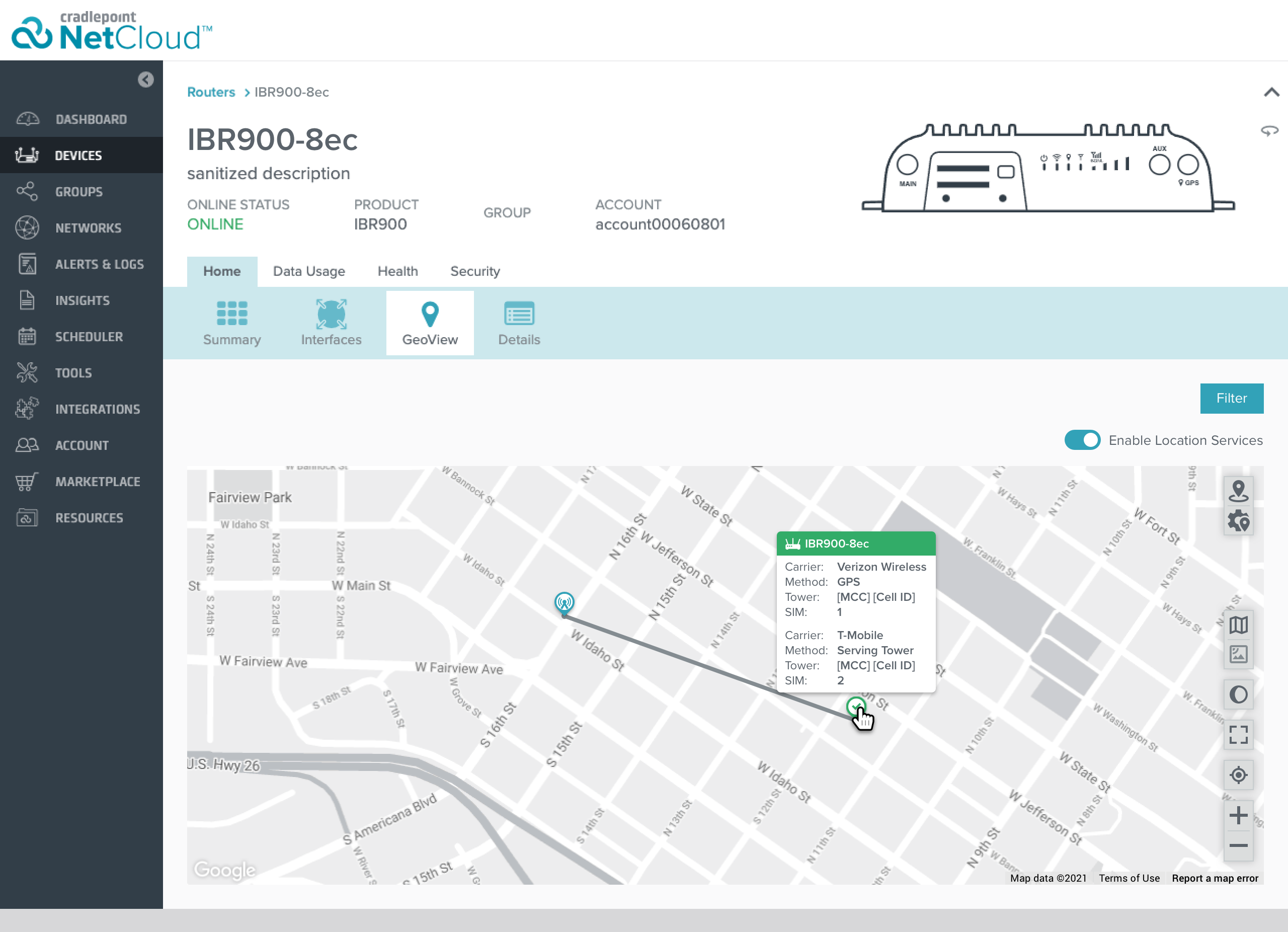
Device Geoview. When hovering over a device, a window appears showing essential information, along with its connection to a tower.
Part 2
Case study on map icons
Size, the current icons are pretty large and cover the map, it's not a great viewing experience. The current icons lack a pointer, so it’s hard to pinpoint the exact location of the device when looking at the map.
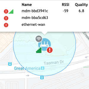
The badges on the icon could look pretty cluttered especially when there are several 100 devices nearby of each other.
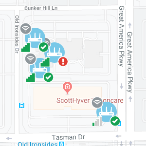
Size, the current icons are pretty large and cover the map, it's not a great viewing experience. The current icons lack a pointer, so it’s hard to pinpoint the exact location of the device when looking at the map.
Having so many different available combinations available which could potentially cause technical problems when rendering the location on the map.
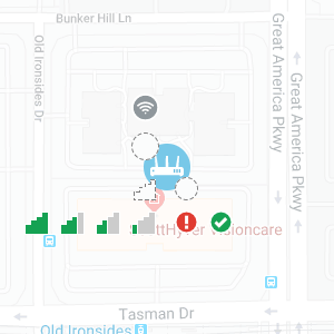
Goal
To give a clear, consistent view of the device's location and status (online/offline) on all maps in NCM.
Solution
I gathered information from Google Maps and Zillow's website to get a better feel of how to display large amounts of data points in a single map. With a clear, consistent view of each router, all users can see the status at a glance.
Icons in context
Old vs. new Geoview, and the goal states
Before
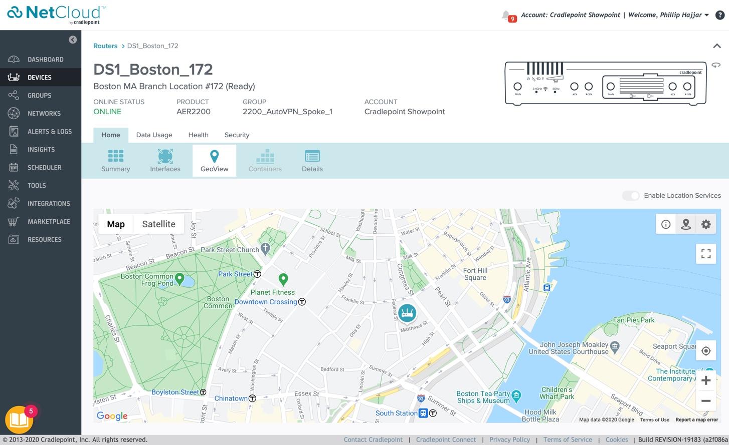
Device Geoview, old version.
Before
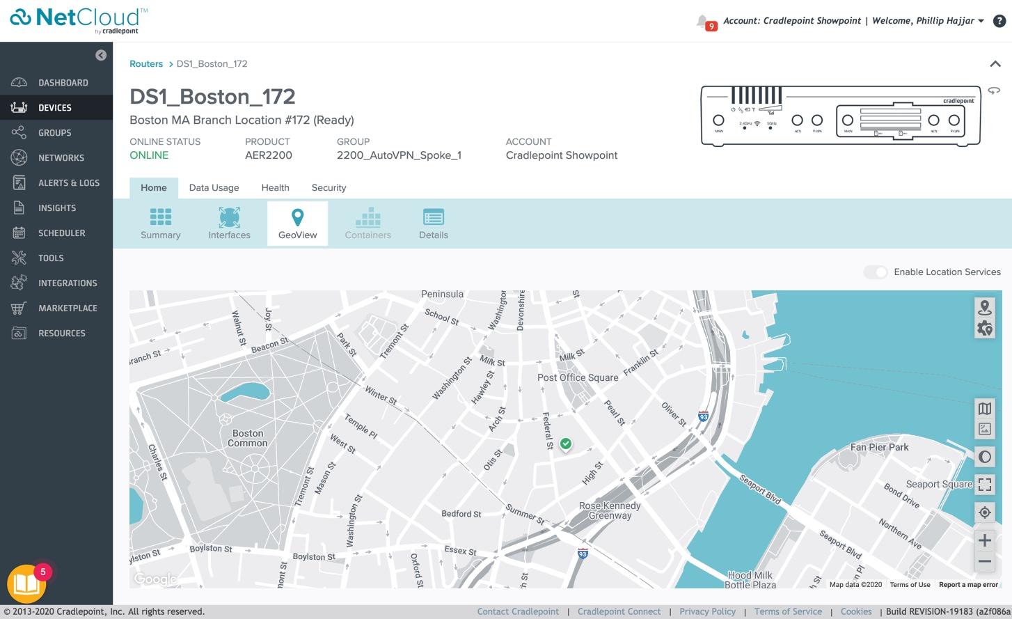
Device Geoview, new version.
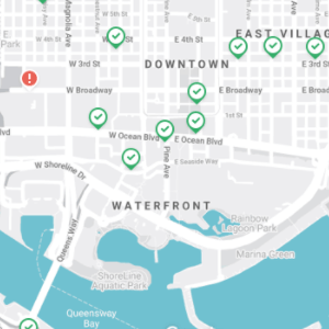
Zoomed in. Devices are clearly displayed as either online or offline.
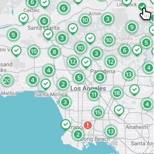
Zoomed out. Clusters grouped by location and online status.
Going The Extra Mile
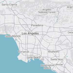
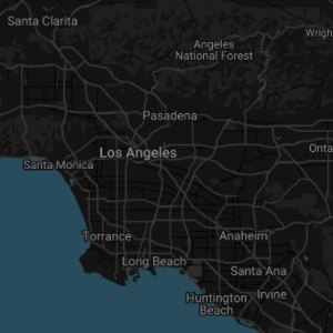
As a proof of concept, I created an entirely new map designed to align with our interface, incorporating colors from our style guide. To enhance user experience, I developed both a light mode and a dark mode, giving users the flexibility to choose their preferred theme.
Outcome
Impact
What changed
The point of using dummy text for your paragraph is that it has a more-or-less normal distribution of letters. making it look like readable English.
The point of using dummy text for your paragraph is that it has a more-or-less normal distribution of letters. making it look like readable English.
Reflection
What I learned
What changed
The point of using dummy text for your paragraph is that it has a more-or-less normal distribution of letters. making it look like readable English.
The point of using dummy text for your paragraph is that it has a more-or-less normal distribution of letters. making it look like readable English.
Next project
Cradlepoint: Speed Test
Re-architecting the on-demand Speed Test for installers and remote troubleshooting.
Let's talk
Meridian, ID
designed@philliphajjar.com
Website Designed by Phillip Hajjar